OZ | December 29th, 2007 | Advertising, Architecture and TV |  | Bookmark
The illusion of a contradictory space within another urban space was arguably instigated by 3D street art, an evolution of past trompe l’œil techniques. First attributed to artist/architect Kurt Wenner and further popularized by Julian Beever, their chalk paintings use anamorphosis projection to create a 3D illusion when viewed from specific angles (see appended).
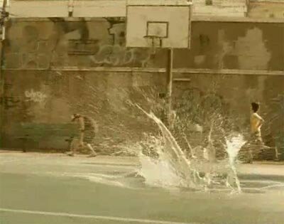
The realm of visual effects affords more unique opportunities as seen in the seminal 2005 Sprite commercial, Liquid Freedom. The ad was conceived by John Shaw, Simon Handford & Sylvester Song at the Hong Kong office of agency Ogilvy & Mather. Directed by Josh Taft at Gang Films, the spot features a basketball court that unexpectedly doubles as a swimming pool with visual effects by French firm BUF (famed for their digital set work in Fight Club and Panic Room).
Continue reading ‘Space within Space’
OZ | December 21st, 2007 | Events and Websites |  | Bookmark

Time constrained competitions between new media artists are all the rage nowadays. From Cut & Paste to Fjorg! they remind me of South Korean gaming events that resemble concerts or sports events. Fitting in a world where capitalism demands accelerated creativity. At the risk of sounding like Andy Rooney, I’m not inclined toward such events. They’re a factor in building misconceptions that are forcing visual creatives to complete projects at an increasingly faster rate. A significant issue, epitomized by the continuing ramifications in the visual effects industry after Spielberg’s War of the Worlds wrapped post only three months after principal photography.
That aside, these visual jam sessions can be a great outlet for artists and entertaining for onlookers as evidenced by Layer Tennis. A well executed venture of the Chicago based design, advertising and interactive studio, Coudal Partners.
Matches are played “using lots of different applications, from Adobe Photoshop to Adobe Flash, but the basic idea is the same no matter what tools are in use. Two artists (or two small teams of artists) will swap a file back and forth in real-time, adding to and embellishing the work. Each artist gets fifteen minutes to complete a “volley” and then we post that to the site. A third participant, a writer, provides play-by-play commentary on the action, as it happens. The matches last for ten volleys and when it’s complete, everyone with an opinion sounds off in the Forums and we declare a winner.”
Continue reading ‘Layer Tennis’
OZ | December 17th, 2007 | Aircraft |  | Bookmark

The graceful grandeur of zeppelins are a sight to behold. That they’ve vanished from our skies for almost half a century has only added to their mystique.
Zeppelins have since made a burgeoning comeback, fueled further by inventive designs for the next generation of airships. The Tino Schaedler and Michael Brown designed StratoCruiser, previously featured here is one example. Another is the Aeroscraft ML866, covered last week by dezeen. A far cry from the cigar shape of Graf Zeppelin’s airships that came off the line in Friedrichshafen during and preceeding World War I.
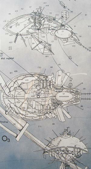
Recent articles on curbing global warming note the potential of carbon dioxide scrubbers, though estimates indicate practical large scale implementation is still a decade away. This reminded me of a curious zeppelin-esque design that caught my attention several years ago in the Taschen book, Green Architecture. The Ozone-maker, designed by architect Jeffrey Miles.
Continue reading ‘Ozone Maker’
OZ | December 10th, 2007 | Games |  | Bookmark

One of the best computer role-playing games in years, The Witcher, also features some of the most fascinating art direction. The dark atmosphere and dilapidated world doesn’t house the grandiose architecture featured in similar games of its ilk. Yet with unique flourishes and attention to detail, it’s equally effective, even more so.
A circular room within a crumbling fortress features a vaulted ceiling that converges into a central fireplace. It’s an ingenious combination of the central hearth common in residences through the 18th century and the vaulted ceilings of Romanesque architecture. An impressive space enhanced by polished marble floors and stained glass windows.
Continue reading ‘The Witcher - Art & Architecture’
OZ | December 7th, 2007 | Film, TV and Websites |  | Bookmark

The Art Directors Guild, the Hollywood guild whose members handle the production and set design for television series, films and commercials, has publicly made available select design presentations provided for their eleventh annual awards. These PDF presentations are occasionally accompanied by quicktime video clips highlighting the sets. Unfortunately some PDF files suffer from over compression and low resolution source material; recommend viewing at seventy five percent zoom.
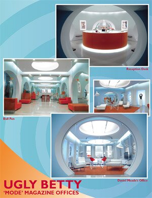
The presentation for Ugly Betty, (Winner for Episode of a Single-Camera Television Series) featuring prodution design by Mark Worthington, is the real standout. While this presentation is apparently the only one not present on the new Art Director’s Guild website, it’s still accessible from its prior incarnation.
Another highlight is the pilot for Aaron Sorkin’s defunct NBC series, Studio 60 on the Sunset Strip, which interestingly incorporates 3D wireframe models of the main set. Most presentations are relegated to television, though Superman Returns is done justice with well varied examples. Other productions covered include House M.D., Heroes, Hell’s Kitchen, The Queen, Stephen King’s Desperation, and more.
OZ | December 2nd, 2007 | Identity |  | Bookmark

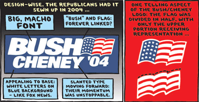
A Ward Sutton illustrative opinion piece from The New York Times has been making the blogosphere rounds for a couple of weeks now and I’ve been remiss not to highlight it. An analysis of campaign logo design, Reading Tea Leaves and Campaign Logos is political humor at its best.


