Please maximize and play LOUD!
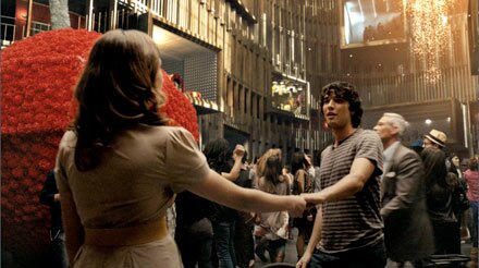
This spec teaser film, directed & 3D CGI by ArTect’s publisher & writer Oliver Zeller, reveals an evolution in computing interaction. Within a setting inspired by the penultimate scene from Stanley Kubrick’s 2001: A Space Odyssey.
Continue reading ‘Immersive Cocoon “2011″’
OZ | September 17th, 2009 | Special Feature and TV |  | Bookmark

On July 7th, The SciFi channel rebranded itself to Syfy. The new name was perhaps the most widely derided since Nintendo’s market leading Wii. Nonetheless, it appears to be paying dividends with increased viewership. Syfy’s previous identity remained intact with expanded brand potential, in an era where the traditional television model continues to erode.
Rather than being branded as a destiantion for only sci-fi, they really wanted “to own the imagination space.” This led Syfy to commision an ident short film, House of Imagination, as part of their Imagine Greater campaign.
BAFTA & Cannes Lion award winning 4Creative spearheaded the endeavour, directed by Brett Foraker. Accompanying him, the cinematographer of Watchmen, Lost and 300, Larry Fong; and production designer Tino Schaedler, whose credits include Harry Potter and the Order of the Phoenix, and The Golden Compass. Visual effects were provided by the Moving Picture Company.
Following is a behind the scenes glimpse of the design, courtesy Tino Schaedler. Each set focuses on a space, featuring concept art & digital set designs accompanied by construction photos and the finished shot.
Continue reading ‘Behind the House of Imagination’
OZ | May 26th, 2008 | Special Feature |  | Bookmark
Last month’s debilitating hack overshadowed the one year anniversary of ArTect.net. Plans to celebrate this milestone have been oft delayed due to my continued presence in Morocco working on next Summer’s Prince of Persia film. Further compounded by the need to correct browser specific format issues stemming from the hack and subsequent backend upgrade.
So to commemorate, a compilation of features from the past year, culled from ArTect.net’s database of approximately one hundred and fifty articles.
 Ocean Arcologies
 | An area of particular fascination since childhood, Ocean Arcologies equally captured the imagination of ArTect.net’s readership. Read by over ten thousand unique visitors within a month of the article’s publication and linked by over a dozen blogs.
The issue of ocean arcologies as potential city-states was recently a topic on Geoff Manaugh’s superlative BLDGBLOG. This following an article in Wired about “a small team of Silicon Valley millionaires who hope to develop a permanent, quasi-sovereign nation floating in international waters.”
Continue reading ‘ArTect.net: A Year of Articles’

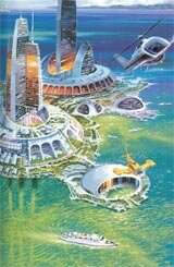
The notion of cities condensed into a singular structure or hyperstructure, has frequented works of fiction as far back as 1899 with H.G. Wells, When the Sleeper Wakes. The concept garnered wider attention seventy years later when Architect Paolo Soleri published, Arcology: The City in the Image of Man. Massive self sustaining habitats, the pliable infrastructure and small ecological footprint of arcologies avoid the damaging, inefficient urban sprawl of today’s cities and suburbia.
Despite increasing stresses on our existing societal structure and a world population rapidly growing to unsustainable levels, land based arcologies appear unlikely in the foreseeable future. The answer may reside with the remaining seventy percent of the Earth’s surface, our oceans. Ocean arcologies could utilize ocean thermal energy conversion (OTEC) or derive energy from the ocean’s perpetual motion to provide abundant pollution-free energy. Fresh water would be available via desalination. Despite the inherent dangers and high expense, the surface of Earth’s oceans are already littered with surprising structures from Sea Forts in the Thames Estuary to the famed remnants of Florida’s Stiltsville and of course the ubiquitous oil rig. Following, a compilation of ambitious ocean arcology concepts.
Continue reading ‘Ocean Arcologies’
OZ | November 16th, 2007 | Film and Special Feature |  | Bookmark

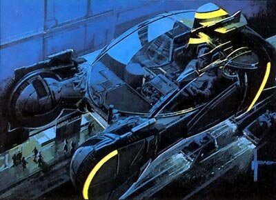
Of the design philosophies behind Blade Runner’s indelible visuals, retrofitting was the one that remained in my mind’s eye. Blade Runner’s visual futurist, Syd Mead explains, “Things are “retrofitted” after the fact of the original manufacture because the old, consumer-based technology wasn’t keeping up the demand. Things have to work on a day-to-day basis and you do whatever necessary to make it work. So you let go of the style and it becomes pure function. The whole visual philosophy of the film is based on this social idea.
The city was getting very dense. Buildings 3,000-3,500 feet high would have old, ten and twenty story buildings underneath, functioning as service accesses to the huge megastructures. Cables and generator tubes, delivering air and waste, would go up outside of the old buildings because they were still there. The street level becomes a service alley to the megastructures towering above.”
It was as if the city’s underground infrastructure had risen out of the bowels of the Earth to adorn buildings. Like the roots that sometimes swallow the architecture of ancient civilizations. It’s a seemingly antithetical philosophy for a film of such visual splendor. Yet these purely functional elements create a convincing reality and atmosphere amidst neon signs, lit umbrella handles and other alluring lights. At its essence, Blade Runner captures the photogenic nightlife of dense modern cities and pushes it to new extremes.
Continue reading ‘Blade Runner Design’

Eve Kushner’s November Builder/Architect Magazine column, entitled a Dream World Made Real, introduces the work of seminal architect Eugene Tsui.
Upon seeing his design for “Solarius” (above) many years ago, I became an instant admirer of his work and attained further appreciation while reading the convincing principles detailed in his book, Evolutionary Architecture: Nature as the Basis for Design.
To coincide with her latest column, ArTect.net is exclusively featuring the opening chapter of Eve Kushner’s unpublished book, Wild Buildings, Wild Lives where she brings to the light this incomparable architect and how he freed her mind.
Read the PDF of Dreamworlds in the Light of Day: How Eugene Tsui Freed My Mind.

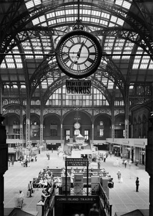
Perhaps the greatest threat to noted historic buildings are the politics and economics of the moment. Here in New York City this is best exemplified by the destruction of the original Pennsylvania Station. This wondrous, grandiose structure designed by McKim, Mead and White, was built in 1910, only to be torn down a half century later to make way for Madison Square Garden. I’m a Knicks fan and it may be the world’s most famous arena, but it’s far from the world’s finest arena. To add insult to injury this prime piece of New York real estate is property tax free while owner James Dolan and company have mastered the fine art of throwing money away.
A New York Times editorial from October 30, 1963 noted, “Any city gets what it admires, will pay for, and, ultimately, deserves. Even when we had Penn Station, we couldn’t afford to keep it clean. We want and deserve tin-can architecture in a tinhorn culture. And we will probably be judged not by the monuments we build but by those we have destroyed.”
Instead we were given a rat maze in replacement and a terrific space that had other potential applications, conference and exhibition center for example, was lost. Ironically, the daily traffic of the underground Penn Station replacement has become so great that an extension into the massive Farley Post Office opposite the Garden has been proposed. An extension designed by architecture firm Skidmore, Owings and Merrill that I helped visualize in 2001 at KDLAB, (SOM Journal 1, pages 36/37). The Farley Post Office, also designed by McKim, Mead and White, will be the last example of their work in the area as the 1918 Pennsylvania Hotel is also slated for demolition. One beneficial outcome of this incident, it resulted in the New York City Landmarks Preservation Commission, spurring historical preservation throughout the United States.
Unfortunately this remains a common worldwide issue.
Continue reading ‘The Frailty of Architecture’

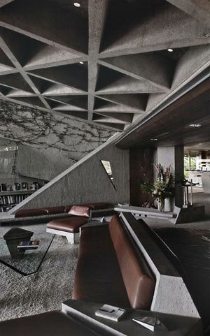
The architectural work of John Lautner became immortalized in popular culture with the 1971 James Bond film, Diamonds are Forever. Sean Connery’s final official turn as Bond, also put on display the Lautner designed Elrod House. With all the extravagances in Diamonds are Forever, which included the Ken Adam designed penthouse apartment of Willard Whyte, this scene is arguably the most memorable. Perhaps that has something to do with Bambi and Thumper, the athletic female duo that gleefully pummel Mr Bond. Even so, the spacious interior, panoramic vista and interplay of diagonals with circular forms, leaves an ever-lasting impression.
Continue reading ‘The Limelight on Architect Lautner Never Dies’

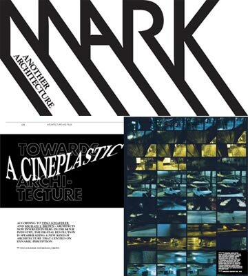
MARK Magazine #9 dedicates a section to new perspectives on the relationship between architecture and film, spurred by advances in digital technologies. Tino Schaedler, Art Director for Digital Sets (Harry Potter and the Order of the Phoenix), and his Studio Digital Analog co-founder, Michael J. Brown, explore this theme in Towards a Cineplastic Architecture.
In an online exclusive, the article has been made available here at ArTect.net in its entirety courtesy Tino Schaedler and MARK Magazine Editor Arthur Wortmann.
Continue reading ‘Towards a Cineplastic Architecture’


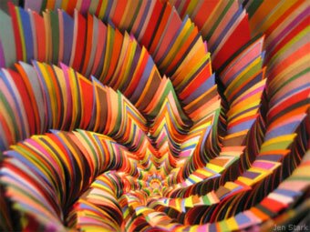
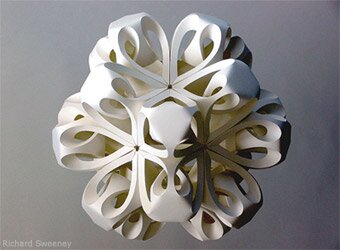
Paper has become the material of choice for several sculptors in realizing stunning diverse designs.
Jen Stark evokes M.C. Escher on LSD with her use of colored, stacked construction paper and exploration of infinite arrays. New York residents and visitors have the opportunity to see her work first hand with a solo exhibition, Primaries: New Works by Jen Stark, starting this Friday, May 18 through July 1, 2007 at LMAKProjects Williamsburg. (See article end for exhibition address & hours.)
Richard Sweeney’s sculptures are elegant explorations of form, often inspired by geometrical and natural structures. His paper sculptures have appeared in a variety of commercial mediums including album covers and recently in DKNY’s flagship London store. Richard offered a glimpse into his creative process with an untitled project still in its experimental phase, potentially slated for this September’s Tuscany based international paper festival, Cartasia.
Continue reading ‘Paper Sculptures’

