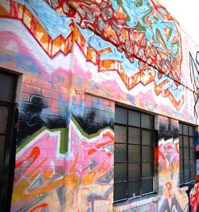
Three distinct art forms converge on the corner of Broadway and Cloverfield Boulevard in Santa Monica. A building clad in graffiti since 1991, by famed graffiti writers Slick, Risk, Den and Severe, now houses the digital artists of editorial studio Rock Paper Scissors and visual effects boutique a52. The latter perhaps best remembered for their avant-garde title design work on HBO’s Carnivale, and Rome.
The building’s interior, once home to Producer Andrew Vajna’s (Rambo:First Blood, Terminator 2, Total Recall) Cinergi Pictures (Die Hard with a Vengeance, Judge Dredd, Nixon), has been redesigned by architect Bruce Bolander for Rock Paper Scissors/a52 owners Angus Wall and Linda Carlson. After fifteen years in West Hollywood, they decided to head west and set-up shop in the digital artist hub, Santa Monica.
One very important feature from the West Hollywood location was a roll-up door that was virtually always open, where Carlson spent much of her time. Since one of the design ideas for the new space was to provide views that go all the way through the building, the existence of a big roll-up door in the back has proven to be a key feature. Glass panels have been installed on the opposite side of the building from that door, which open up onto a garden of green plants and let in sunlight, blue skies and fresh air.As the project moved forward, Bolander, Wall and Carlson sought unique ways to tie into the aesthetic set by the outside of their new building, to provide the companies’ editors, artists and producers the creative spaces and all the required technical touches - and also, as much as possible, to make the furnishings reconfigurable, to accommodate group interactions of various proportions.
“We didn’t want the aesthetic to be as industrial as it was at the previous place,” Bolander adds. “So that was another challenge with this: To get it kind of refined, get it a little more pure, strip it down to more of the essential. We wanted the overall look and feel to be at least somewhat understated.”
When the new lease was signed, the building’s 21,000 square foot interior was already completely built-out. Bolander says that he and his clients examined several plans to keep much of it intact, but finally decided to start over from scratch. Focusing-in on designing the suites for Wall, his fellow RPS editors and a52’s artists, the layout began with the suites laid-out like cubes in an ice cube tray. Ultimately, though, Bolander decided to make it look like he had drawn the lines of the walls freehand, so that they are still parallel, but just slightly off.
“In between the suites, we also have these little canyons,” Bolander continues. “It was a device we used to provide sound insulation, but it’s also really nice visually, because as you walk down this long row of offices and you can actually see through to the other side. Most of them are too small to walk through, and I really like that you kind of want to get there but you have to take a different path - you’re seeing your goal, but you can’t get there directly. I think that’s kind of nice.”
Following initial discussions about prominently featuring interior windows in the design, an idea inspired by Le Corbusier?s Ronchamp chapel, Bolander also used windows of different sizes, placed at different heights, in the suites. In fact, the windows are designed to allow someone to look all the way through the building, through each of the interior suites, and into a window in another building. For the bigger windows in the bays, some are heavily tinted and others are clear, depending on factors that include how much light they get, if they’re located on a hallway, and the personality of the person who spends the most time in that suite.
“This ties into our idea of keeping things pure and understated,” Bolander points out. “If you look at these windows in the walls, they’re flush with the drywall. That looks really simple, but it?s actually not that easy to build. We spent time and effort and resources on simplifying things instead of putting another finish material on the outside. They’re not plywood or corrugated metal - this is as cheap as it gets for the actual finish material, but the windows and some of the other touches are not.”
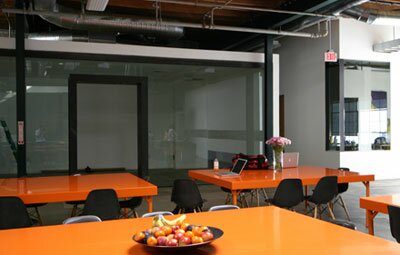
Because of the need to accommodate between 40 and 100 or more people for lunch on any given day, Wall and Carlson wanted a big common lunch room and a big central kitchen. In the same way that the interior design offers some flexibility in how people work in the new space, Bolander has also introduced some flexibility with the furniture ? although many specific pieces are still being decided upon. Referencing a large plywood table which Wall and Carlson have had “forever” which has never been used due to space constraints, the architect says, “The proportions and the construction of that table are really nice, so my idea was to use that and create new versions, of the exact same size, proportion, and construction details, but made out of Corian and steel, for use in the conference room, kitchen and lunch room.”
Natural light is perhaps the greatest workplace design issue facing today’s digital artist. Something any artist whose monitor has been washed out by glaring sunlight will attest to. While the building’s exterior captures the creativity brewing inside, these carefully positioned array of windows onto the world beyond sparks creativity from within.